Originally Posted By: surfstar
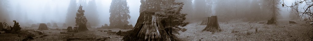
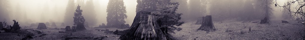
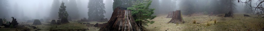
I have also thought of adding some noise and trying to antique it a bit - just too many options.
I'm always in favor of the KISS principle. I wouldn't fiddle around too much with the image. I'm not in favor of adding fake grain. I love (real) grain, but in this case I'd rather go for a creamy tonality and texture. Instead of antiquing (sepia, or whatever you have in mind) the image, you may consider having the image printed on a warm tone paper. Of course, I have no idea what kind of printing service you have available, so your choice may be limited by what they offer. Since you take so many pictures that are worth printing, you should probably get a good printer.