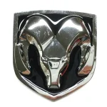
Ugliest car emblem.....

I'm going to say that Asian cars in general have been getting progressively uglier. Their emblems as well. Kia and Hyundai at the top.

My goodness did a transformers cartoon artist draw these things?
 
Original Hyundai and Kia Logos were the same size and shape as the Ford logo because they used old tooling / stamps from Ford.
 
How could I forget this Chrysler logo they brought back in the 90's? Looks like something a pig that won second place in the Iowa farm contest would get.


Annotation 2022-04-14 222136.jpg
 
I kinda think they did a good job... but there was a time, not so long ago, that I thought that the cachet of a Kia was pretty much non existent. I'm not sure I still feel that way though.

Funny thing, that. I remember when "made in Japan" was being in the penalty box. Then Japanese artisanal pride became known. Like their knife-makers... Then, made on HongKong was in the penalty box for me... and that changed. Then made in Taiwan was that way for me. Then that, too, changed. Now it is Made in China that is not premium, for me... But that actually is changing, at least by way of varying quality levels. I'm still not enamoured re supporting that bully, by way of international behaviour...

But I digress, sorry.
See, I actually like Kia’s. I think the Telluride is/was, the best looking SUV I’ve maybe ever seen. The Telluride had to be the hottest selling SUV in America a couple years ago, and it still looks modern today. Except for that new logo. Wow, that thing looks ridiculous on their beautiful looking cars and SUV’s. IMO.

But I really like Kia’s...the interiors, the exterior design, some of their V6’s are solid. They drive nice. I see them all over the place now - and for a reason - they stand out in a good way. But quite honestly, I now honestly think their new emblem just brought them down a peg. I’m serious. It cheapened their brand and made them look like a five year old has taken over design and marketing. I don’t know who this guy is, but I imagine he’s now checking the job classified adds. I’m being overly dramatic, but I seriously have never seen such a horrendous logo...and I don’t know why Kia gave THAT the green light. It’s just my opinion.
 
I Have been looking at prewar BUICK 8 vehicles, and this large, bulging wart of a trunk emblem struck me as particularly grotesque. Some are even back lighted to make it worse - or the first CHMSL.

buick images.jpg
 
Isuzu (a complete lack of imagination in color and form and a ridiculously anodyne inspiration), Ford (too old-fashioned a script), and my most despised, Jaguar (the new roaring face, which replaced the classy and eternal leaping cat body).
 
GM, Dodge, and the Koreans have the ugliest to me. The bowtie has always been crap, modernized caddy/buick look cheap while the old ones look dated, and hyundai is offensively ugly. Tesla is pretty bad too.

Japanese besides subaru are a bit ugly to neutral, although I love a classic block font TOYOTA or NISSAN sans emblem. Subaru or Lexus best from Japan but neither are great. Ford emblem is fine, but the contrast of their somewhat generic modern body styling with the classic style logo clashes too much.

Euro makes have by far the best emblems.
 
The new Kia emblem seems to be 25% to 50% to large in most cases, and it needs some kerning. The old one was one of the worst car emblems
 
I personally like when a manufacturer keeps the same logo. Honda and Ford come to mind. Generally speaking something updated looks/seems cheap.... or copycat.
 
Back
Top