Originally Posted By: Tempest
Originally Posted By: Shannow
Would be nice if the graph started at zero rather than 270.
I agree. Virtually all of the charts on line are like those above. I did find one a little better:
The problem with this chart is that it only covers the last two data points on the second chart... I'd say its even more misleading. Although if we had a reasonably science savvy population we probably wouldn't be arguing about graphs of CO2 concentration, we'd be taking real steps to reduce the concentration...
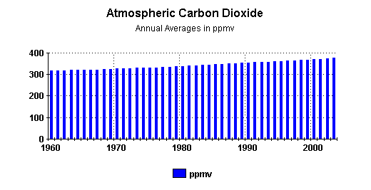


