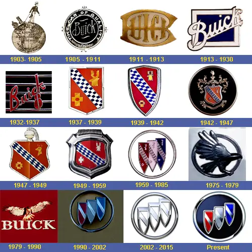
Buicks new Logo

My old startup company Quantum Lead Electronic Packaging changed it's name to be better positioned in the Global market.

It became simply QLP

maybe this is just middle east market only
 
I think that's the whole point.
It needs to fit a demographic to compete. Corps compeete on every level they can think of to win. That's all that matters. Often even "legal" doesn't...
 
I hate this, these emblems have storied histories that have been around for decades. Why change them?
I agree! I have even spoke to high level GM management when they visit my plant about why we cannot just leave well enough alone. The Cadillac emblem is terrible, now the Buick emblem. Remember what they did with the Oldsmobile emblem? They eliminate history and years long brand recognition when they do this - and it is not cheap to change emblems. Ford and many others keep the same logo because the public recognizes them. I remember driving my 2002 Olds Aurora 4.0 and people thought it was a lexus because of the logos! I won't even comment on the new lower case gm logo and how it is just plain dumb. Money spent on this was in the millions - remember every building, business card, stationary etc - gets replaced with the new logo. Money that could have went to product development.
 
Personally I think that the new logo looks like an old logo out of the 70's but I'm in the new world and you know this change was driven by how well this logo scored with Chinese consumers.
 
Looks terrible compared to the earlier logos. I hate seeing what has happened to Buick, like Craftsman, a shell of a former brand.
 
Easy now my fellow curmudgeons. It's not the first nor the last time it has changed.


Buick-Logo-family-History-1.jpg
 
Back
Top